An Introduction
Candlestick chart is a technical analysis tool that examines the current price movements in the market and forecasts the direction of the prices by studying the past market facts. It combines a wide range of trading information all at once in a specified period for visually predicting highly accurate price movements.
Generally, the Candlestick chart can interpret trading in the market driven by human emotions, unlike other chart patterns.
A Brief History
Candlestick chart was originated in the 18th century by an affluent businessman Munehisa Homma in Japan, who observed a relationship between the price and the supply and demand of rice. Homma began trading rice at a local rice exchange called Dojima, which was designed roughly in the 1750s and had more than 1,300 merchants.
He used an earlier form of candlestick chart to predict price movement through which he appropriated great fortune. He carefully observed the price movements based on human emotions and avoided a quick trade. Subsequently, the candlestick chart was popularized in the western countries by Steve Nison when he wrote a book named ‘Japanese Candlestick Charting Techniques’ published in 1991. Nison released the book after analysing that Japan had a traditional base of the technical analysis, which was not based on the Dow works.
Basic Interpretation Of Candlestick Chart
The basic interpretation of candlestick chart assists the investors in predicting the market trends.
Open Price: It is the opening price at which the stock first trades when the exchange gets opened for the day. The top or the bottom of the candlestick indicates the opening price. When the opening price moves upward, the candle usually turns green or blue. Similarly, when the opening price moves downwards, the candlestick turns red.
Close Price: It presents the last price at which the stocks trade during a regular trading session. Similar to the open price, the closing price is present at the top or bottom of the candlestick. If the close price is less than the opening price, then the candlestick commonly turns red, as it depicts a bearish trend. If the closing price is above the opening price, the candle turns blue or green, indicating a bullish candlestick pattern.
High Price: It represents the highest price of the day and gets positioned at the top of the wick/shadow, just above the real body of the candle. If the upper wick/ shadow appear removed, then it indicates the opening or closing price is persisting highest for that day.
Low Price: It is the lowest price at which the security trades on a regular trading day. The bottom of the wick/ shadow represents the low price. There will be no lower wick or shadow if the open or close price stands lowest for the day.
Wick/Shadow: The wick is a beam-like shape presented above and below the real body of the candle. It represents the prices that turned extreme in a specific timeframe.
Real Body: It is the difference between the opening and closing price depicted on the upper and the lowest wick/ shadow of candlestick correspondingly.
Range: The difference between the highest and the lowest price, set at the upper and lower wick/ shadow of a candlestick, respectively.
Understanding The Basic Types Of Candlestick Patterns
The formation of a candlestick pattern requires just one candle, rather than a cluster of them. The trading inclination of the investors is formed by observing the single day trading exchange.
The blog will carry out a brief explanation of the five widely used patterns such as:
- Doji
- Engulfing Pattern
- Bullish Engulfing pattern
- Bearish Engulfing pattern
- Morning Star
Doji
The Doji pattern gets formed when the closing price and the opening price are nearly equal to each other. The Doji pattern signals a momentary change or a temporary thwart. A close inspection generally specifies an uncertainty amongst the buyer and seller where neither of them is gaining as they become indecisive and finally comes at a standoff. The common Dogi patterns are: –
- Dragonfly Dogi
- Long legged Dogi
- Gravestone Dogi and many more.
Engulfing Pattern
The engulfing pattern indicates a change in the market trend in the opposite direction. It appears when the ultimate candle completely surpasses the previous candle. It also states whether the buyers are dominating the sellers or the trend is moving, the other way round.
Further, the engulfing pattern is divided into two, namely: –
Bullish Engulfing Pattern
Bullish Engulfing Pattern indicates a downtrend that can get reversed into a bullish trend. Generally, when the price of the security reaches a minimum value, it lures the buyers to make a purchase. When more and more buyers purchase security, prices tend to move up in the future, leading the bullish to take over the bearish trend.
Bearish Engulfing Pattern
Bearish Engulfing Pattern is opposite to the Bullish Engulfing Pattern, where it indicates an uptrend that will move in the bearish direction. As the stock reaches its highest value, more and more sellers enter the market to make gains.
It leads to a drop in price as the demand is less than the supply of stocks. Consequently, the journey of stock from the highest to the lowest price depicts a bearish trend that gets reflected through the engulfment of the real body of a bullish candle into a bearish one.
Morning Star
Morningstar, as the name suggests, is a candlestick pattern that signifies luminosity in the market of an evident uptrend. It is a bullish reversal pattern where a downtrend gets reversed into an uptrend.
The Morning Star includes three candlesticks: –
Firstly, the large bearish red candle indicates, that sellers in the market are under control.
Day 2 of the market represents a bullish, bearish, or neutral candle where buyers and sellers remain at balance.
Day 3 displays a bullish candle signalling the buyer’s control in the market. Subsequently, the closing price closes near the highest price of the day.
Advantages Of Candlestick Charts
A Candlestick chart provides a visual representation of the market sentiments. It is an effective and efficient way to study the emotions of the investors and, at the same time, to interpret the prices.
It determines the market trend as investors just by looking at the color and length of the candlestick can interpret whether the market is becoming bullish or bearish.
It also gives a glance of the reversal trend where the bullish pattern gets reversed in a bearish pattern and vice versa. That is unlikely to be interpreted through any other chart pattern.
Drawbacks Of Candlestick Chart
The candlestick pattern only determines the high, low, open, and close price. The crucial data between the open and close price does not get depicted on the candlestick.
The candlestick charts fail to provide a clear view of the support and resistance level. Therefore, most investors use the ProSticks bar to identify the resistance and support levels.
Overall, the candlestick chart is an apt tool for technical analysis of the stocks. It is beneficial for understanding price data and trends.
Related Blog
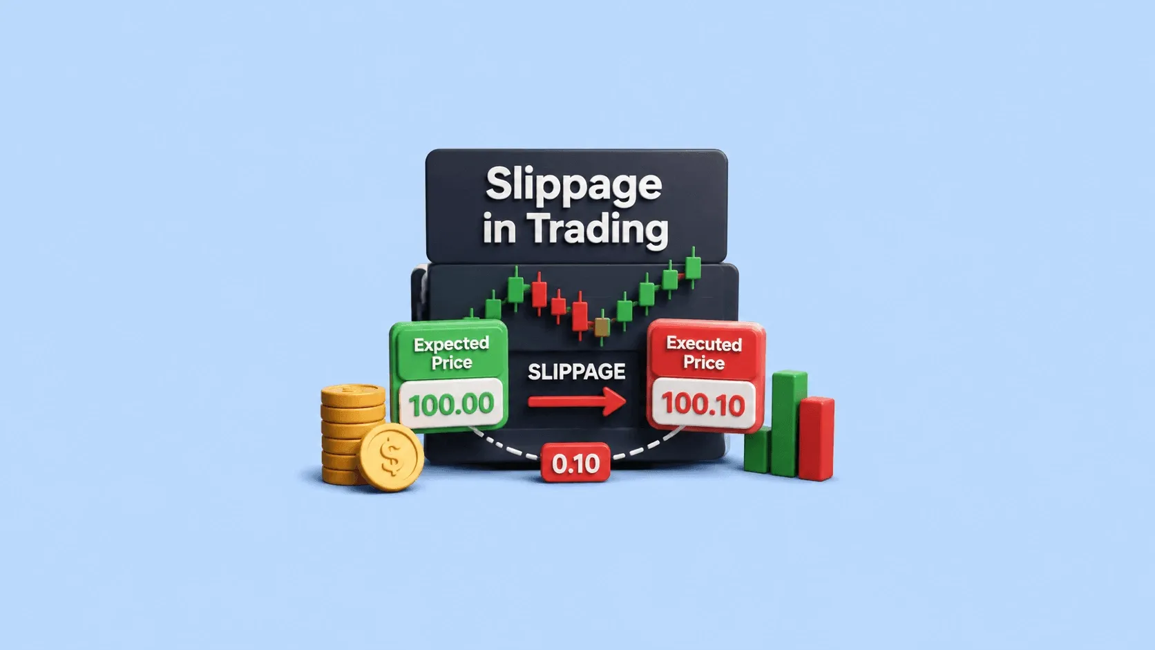
If you’ve ever placed a trade and noticed that the price at which your order got executed is slightly different from the price you expected, you’ve already experienced slippage even if you didn’t know the term at the time. For many everyday investors in India, especially those trading through platforms regulated by the Securities and Exchange Board of India, this can feel confusing or even frustrating. You see one price on your screen, but your trade happens at another. Naturally, the first que
9 July 2026

If you've ever seen headlines like "The IPO was subscribed 25 times" or "Retail category subscribed 8 times," you may have wondered what these figures mean. IPO subscription indicates the demand for an IPO by comparing the number of shares investors applied for with the number of shares offered by the company. Understanding what IPO subscription is can help you assess investor interest, although it should not be the only factor when making an investment decision. In this guide, you'll learn how
9 July 2026

FII DII Data Today 9th July 2026 CATEGORY DATE BUY VALUE (₹ Crores) SELL VALUE (₹ Crores) NET VALUE (₹ Crores) DII 9-July-2026 15,966.33 14,681.08 1,285.25 FII 9-July-2026 13,608.16 13,942.88 -334.72 What are FII and DII in the Stock Market Foreign Institutional Investors (FIIs) invest in the Indian stock market from international markets, while Domestic Institutional Investors (DIIs) include mutual funds and institutional bodies operating from India. fii dii data helps track th
8 July 2026
Made for Traders.
Trusted by Investors.
Download FinX — trade confidently, invest
smarter, track everything.